Yesterday, I made cruel jibes about MS Word 2007’s new ‘Margin’ ribbon-bar button. Today I’ll look at the Ribbon Bar itself in more detail, and some of the other new features. Once again, I have to make the rather lame disclaimer that I have not used the beta software, but I have run the interactive demo to make these comments.
Here’s an animation of the first three ribbons (click for full size):
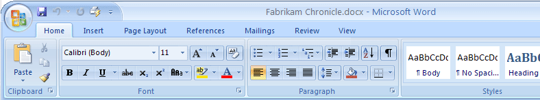
So, first we notice that the new ‘major tasks’ in the ribbon are grouped by:
- Home;
- Insert;
- Page Layout;
- References;
- Mailings;
- Review;
- View.
Now, that’s odd. 6 out of 7 of those headings appear to be ‘action’ related, but ‘home’ does not. Home is where I have my dinner, watch TV, have some sleep. Those are the actions I take at home.
Now, I realise that Home also has a different meaning, it’s my Home in the application, but those other titles are still (nearly) verbs. You can put ‘Do’ in front of them, and perhaps an ‘ing’ and the end, and although you are not speaking my kind of English, it is still comprehensible. Apart from ‘Do Home’. How about ‘Edit’ as an alternative?
Home, therefore, is our first uncomfortable rest-stop. Looking at the different sections and icons, it is easy to see that this is a broad equivalent to the basic set of standard toolbars in previous versions of Word. We see the common font controls, some paragraph controls, and some styles a little bit more visually than previous incarnations.
On to the Insert ribbon. We see sections for Shapes, Pages, Tables, Illustration, Links etc. I can easily see that this is where I will want to go to insert some extra dash of whatever in my documents.
Onwards and rightwards to the Page Layout ribbon. We see sections for Themes, Page Setup, Page Background, Paragraph etc.
 Wait a minute!
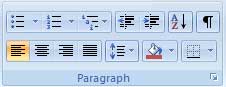
 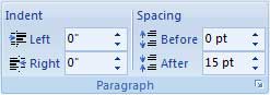 Rewind a little way and play: “Paragraph etc.” Hmm. Seems familiar, wasn’t that in the Home ribbon? Well yes it was, except it was different there. To the right, I present the version under the Home ribbon, and below it, the version in Page Layout.
So let me get this straight; making extra line-space between lines of a paragraph is ‘core functionality’, but changing the Space Before and Space After a paragraph is Page Layout? And Indentation is both, but deserves finer granularity in Page Layout? Well, actually, no to that as well. The kind of indentation offered on the Page Layout ribbon is left and right indentation, whereas the former is just left indentation. I’m sure that in either circumstance, clicking the little arrow at the bottom of the ribbon will give us a fully-featured dialog, but the distinctions being made here are artificial, and will inevitably lead some to frustration.
Picture this. You’ve just inserted something using the Insert ribbon, and you’ve noticed some text that you think might look good indented. Do you:
- Click on the Home tab where you can adjust left indentation, by predetermined amounts;
- Click on the Page Layout tab, so you can get to the Paragraph section there to control left indentation by fine degrees, and also the right indentation should you choose to;
- Get the cursor anywhere in the paragraph and (assuming that rulers are displayed, and that you will be able to do this with Word 2007, as in previous versions) fiddle around with the little black indent / tab markers on the rulers (indicating, guess what, indents) until you have it looking just-so;
- Realise that the style of the current paragraph is ‘Normal’ and that the right thing to do is to use the pre-defined style ‘Normal Indent’, which is probably best accessed from the Home tab?
Which is the best way? Which is the right way? Is there a right way?
Answer: It all depends.
And which way(s) will the help system tell you to do it (I’m assuming there is one, under References or perhaps off-screen to the right or something)?
I’m not against an application having more than one way of doing something, but when the reasons for change appear to be motivated by chrome and simplification of the interface, I think you should be sure that the model you use will be simple and clear too.
How Much of Word 2007 Do I Need?
Of course, I don’t really know. But let’s look at Word 2003 first. There are 9 menus in all, and I regularly use 8 of them (Window menu rarely gets a look in). I could feel then like I use 89% of the program. With Word 2007, I don’t feel like I’m going to use Mailings at all, and Review sounds like the document comparison and notation stuff which is rarely useful to me, so on that apparent basis, I’m only going to use 71% of the new application. Of course, the maths is crass, but somehow it does reflect my feelings on first viewing.
But There’s More
Look what happens when you select a picture (click for full size):
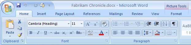
Did you spot it? A new ‘contextual’ Format tab has appeared under the ‘Picture Tools’ flag. Once again, the argument for this sort of feature was undoubtedly related to cleaning up the UI, but to me it smacks of those nasty little ‘Personalised Menus’.
I hated personalised menus.
I built up a mental-map of where functions I wanted were on menus. It didn’t matter if I had to move the mouse over a certain number of greyed-out entries, the entry I wanted was always effectively in the same place. Personalised menus moved the goal posts, and it did it right in front of your eyes, and often in several different ways even in a short time of using an application. It was like going down to the local stationery shop, and finding out from the sign on the window that they had moved a few doors down the street. Not far to go, but still a surprise and a little bit of a distraction.
Let’s look at that word they have chosen for the ribbon-bar image context sensitive menu: “Format”. Yes sure, I’d like to be able to format images ~ but don’t I also want to be able to format text? Well, of course I can format text, in almost every other ribbon bar. Just not in the Format (image) bar.
Interlude
Occasionally, my mother asks me to help her with some problem or other with Word. She doesn’t use a computer much, and even though she has been on some courses for Word, and uses that application more than others, she still struggles with the basics. But personalised menus probably caused some of her biggest frights, until I turned them off. She already thought the computer was out to get her. She clicks the mouse button when she shouldn’t, and drags the mouse when she means to click. Panic. But what does she say when she sees a menu unfold in front of her eyes?
“What did I Do?”
Do you know that some people like to describe things from the specifics to the generics, and some people prefer the other way? Say I want to tell you how to find my favourite pair of fluorescent socks (my favourite pair, you understand, not the orange or green ones). I might tell you: “Go upstairs, go through the door immediately in front of you, and look in the top-left drawer in the chest of drawers. Please could you bring me the fluorescent yellow socks?”But maybe someone else might say “Please could you bring my fluorescent green socks? They’re in the top-left drawer of the chest of drawers, which is in my room, right at the top of the stairs.” Really! Some people preferred the green socks! We’re all different and there’s simply no accounting for taste.There are similar differences (ha ha!) in the way people like to learn software. Like, trying to describe to my mother how to do something that she is not actually doing yet. So, without personalised or context sensitive menus, I can show her that when she has imported a picture, there is a menu entry that will no longer be grey – it will be right there and it will not be grey any more, and then she should click on that and blah blah blah. But with those context sensitive shenanigans I won’t even be able to show her the menu until she actually has an image to select and play with.
It’s the equivalent of arriving at Tokyo Narita airport, without being able to speak a word of Japanese, and being worried that there won’t be any signs in English, and everyone knows the cabbies there don’t speak English, and what will happen to me and how will I cope? That for me, was fearing the unknown. The world of Word etc is comparably the ‘unknown’ to so many people, and things keep on changing on them, and don’t ever forget that the internet is dangerous and ‘thare be dragons‘.
I know, I know. So many people learn by doing rather than by discussing, taking notes, or whatever. So you say; “Try it with any picture. Get her to do the actual task with a picture, and then she will be more prepared for the real thing”. But to her, this is like saying “You can’t do what you really want to do yet, this isn’t the real thing at all” when all she is wanting is to paste a new picture of her grandchildren into her latest round-robin. And she will find excuses, for why this isn’t like the real thing.
She’ll feel like I could have felt, had anyone told me that I’d be a lot less worried about Tokyo Narita, if I flew to Paris and Kigali airports first. Have you ever been waiting for a delayed flight in Glasgow Prestwick? No, that isn’t going to put your mind at rest about airports at all.
Yes, the strange customs of context sensitive menu (bars / ribbons) makes many people computer-Gaijin; flummoxed foreigners in a strange land.
…and More
Highlight some text. What do you get? A new ‘mini toolbar’:
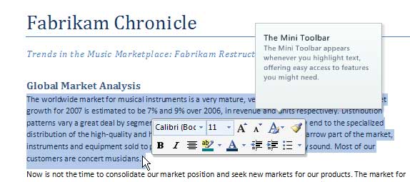
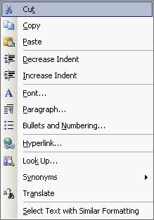 Can you see a problem? Ignore the little call-out, which is part of the demo. What if I had highlighted some text to read it? OK, perhaps if I had highlighted a few words, the mini toolbar would not cover them. But a paragraph, as here? What if I want to change the style (not the font)? Why not make this something that pops up when you right-click, as an enhanced drop-down menu? This is what the current (Word 2003) context-sensitive drop-down menu looks like when selecting text. Now, a lot of those options apparently lead to dialogs of one sort or another, but what if the top option had been “Show Mini Toolbar”? I have criticism for the 2003 version too. I think Cut, Copy and Paste should be the one set of keyboard shortcuts that everyone knows. But look, they haven’t even put the keyboard shortcut on this menu for some reason! So, these functions are so damn important that they need to be on the context menu. But not so important we want you to be able to access them quickly if both of your hands are hovering, hawk-like, over the keyboard.
Live Preview
Live preview looks like it will be a really useful feature. For many dialogs, e.g. the font type and size drop-downs, the display will update as you float your mouse over the various entries ~ and apparently most of the ribbon tools are live preview in this way. I like the sound of it, but with some reservations.
I can also see that Themes (essentially, pre-produced style sheets) will be useful for some.
I think there is going to be even more of this tomorrow…