Jeff Atwood has posted about the Sugar UI, which is the proposed operating system for the $100 PC, ‘One Laptop Per Child’ initiative. He looks at the new OS, which has been designed to be a new experience for first-time users of a PC – read ‘Children’:
I’m interested now.
I’ve been disappointed in the lack of GUI innovation over the last decade. Sure, Microsoft and Apple take small jabs at each other every couple of years. And the Linux community apes both companies, occasionally throwing in a curveball of their own. But when was the last time anyone tried a radically different UI on the desktop? The Sugar UI featured in the OLPC appears to finally break from the well worn conventions of Windows and MacOS.
And technologically, as a new approach to GUI’s, I entirely agree. This is an interesting take on how we could relate to our network, other users near us, and collaboration.
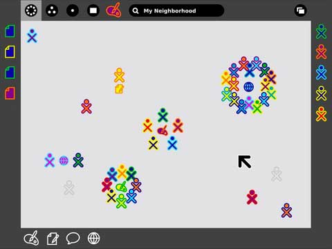
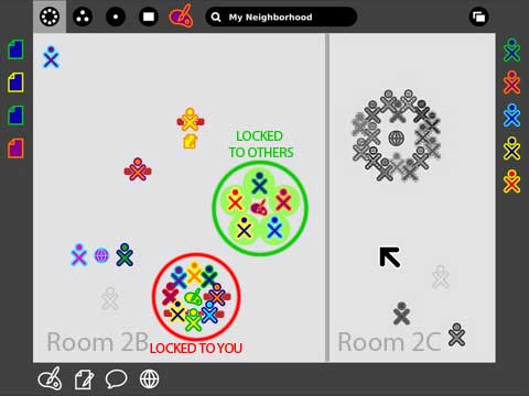
The screenshot above is from the Sugar Instructions on getting started with the software. The little stick-figures are logged-in users and when they are circled around an application icon, it means they are sharing that program. Note the bar at the right, which shows a list of ‘Buddies’ – match the colours to the icons on the main screen and that will help you decide where you want to ‘play’, presumably.
First Reaction
My first reaction to the screen-shot was “Mystery Meat”. I looked at all those icons that meant little to me, and could not understand what they all did. Well, I was wrong; that was all just lack of familiarity… and I don’t think it takes a genius to recognise the icon for the painting program. The layout of the screen seems fairly intuitive to me, and I did interpret the groupings to signify some kind of collaboration or ‘sharing’ of an application – and this of course is one of the interesting aspects of the UI. *
Second Reaction
Then I realised, these laptops are communicating via wireless network. The ‘Neighbourhood’ on display really is a physical neighbourhood; all those little icons represent other students that are near to the laptop the screen-shot was from. It is from this perspective that my concerns were raised. Surely children in the same room or locality should be playing and working with each other face-to-face, not isolating themselves with technology? Of course, you could argue that if the software allows them to collaborate then they are not isolated; my counter argument is that unless the collaboration is remarkably life-like, there will be no fights over the red paint-pot or the yellow crayon. No arguments over who draws what and where. And if you don’t like what someone has drawn on ‘your’ bit of canvas, there is always that electronic eraser to solve the problem. In summary, few if any of the things we may (or may not) have learnt about sharing and physical interactions at the sand-pit or painting table are present in this collaboration.
One of My Favourite Blogs of 2006
It is now time to introduce one of my favourite blog findings of 2006. David Wong’s poignant and amusing 7 Reasons the 21st Century is making us Miserable. Note the post has adult content.
The problem is we’ve built an awesome, sprawling web of technology meant purely to let us avoid annoying people. Do all your Christmas shopping online and avoid the fat lady ramming her cart into you at Target. Spend five thousand bucks on a home theater system so you can see movies on a big screen without a toddler kicking the back of your seat. Hell, even rent the DVD’s online so you don’t even have to mess with the confused kid working the register at Blockbuster.
And Back to Sugar’s Neighbourhood
So Sugar has implemented the ‘Buddy’ list. That right-bar on the screen-shot above represents the user’s friends that are logged in, and which colour icons they have on the main screen. But let’s face it, even though there are ‘only’ about 38 user-icons on that screen, recognising the colours of your friends is a bit of a pain, so they’ll likely add some sort of enhancement to highlight those friends:
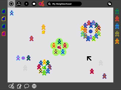
Wow! I really did not expect that. Now I’ve matched up the icon colours, it turns out that this real-world screen-shot is showing 5 friends working together, with no ‘non friends’.
Now, at this level, the choice to go and work / play with friends is not much different from the real classrooms I was taught in – I looked around the different areas of the classroom and chose to go and play / learn with my friends.
On the other hand though, in the real world, one often had to make a choice; you wanted to play on the sand-pit, but someone you didn’t like was playing there. There was only one sand-pit, so you had to make a choice over which was more important to you. In the virtual world, you just start-up your own sand-pit. Once again, no need to share.
Surely the temptation would be to implement other features (I know, I’m stretching it a bit here)… But highlight people I really don’t like:
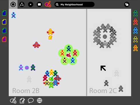
And let’s not forget some real practical issues, like wireless networks do not respect physical boundaries, yet there may be a real need to differentiate different classrooms, to prevent children swanning off and playing at art when they should be practising their writing:
And we only have one more step to take, to get a real-world feel to this:
Summary
I’m sure my speculative ‘enhancements’ to this part of the Sugar UI are unfounded; too many people would resist actually implementing a ‘not a friend’ category in an OS designed for students. Or would they? All of my speculative changes have been done before in other online communities.
My essential point is this, if children absolutely must have and learn to use computers, if this is a step that really has to happen, then surely we should try our best to ensure that they learn in a positive way that enhances physical human interaction, yet does not let us avoid very real-world issues such as sharing?
The Sugar Neighbourhood feature is an interesting one, but certainly they have started on a slippery slope by adding in ‘Buddies’ right at the start.
Finally… I really do recommend the 7 Reasons the 21st Century is making us Miserable post if you can handle a bit of fruity language.
* Thinking about this again, I believe there is some mystery meat here; for the document icons down the left, for example, and even the icons for users could be avatars or perhaps have a text association with them for the user’s name. The fact that associated documentation says that mousing-over an icon reveals additional information about the user suggests that (as practically no useful information is available at first glance) that these icons are indeed mystery-meat. Application icons etc. do not count because they are (presumably) used uniquely and can be learnt.
I couldn’t understand some parts of this article Human Interaction and the Sugar UI, but I guess I just need to check some more resources regarding this, because it sounds interesting.